Better creator pages at itch.io
Alternative layout: lists of projects
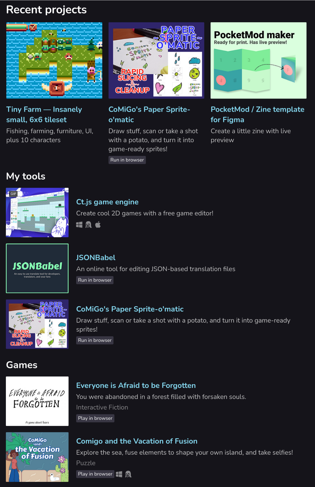
Have you ever wondered why the default “List” mode of collections looks like everything but not a list? Nevermore — I present another CSS code to make your collections look similar to how they are displayed in the itch app or Steam.
Here is how it would look like on my page with fewer projects — it obviously doesn’t scale well with large amounts of projects, but it may be a good pick for smaller numbers of those, especially if your projects have long descriptions. I also have a row with recent projects set up according to this guide.
The guide
Note: This tutorial requires CSS editing in your account. If you don’t have it yet, you can ask support so that they enable CSS editing for you. Also, make sure that you’ve completed the first tutorial that shows you how to set up the creator page with collections.
- Go to your creator’s page and press the Edit theme button at the top.
- Under the list of your categories, set the Collections → Layout dropdown to List.
- Remove CSS code taken from my other guides, if you have any.
- Add the new CSS code:
/**********************************\
| Turn collections to actual lists |
`**********************************/
.user_page .purchased_games .carousel_wrapper, .user_page .collection_row .carousel_wrapper {
  overflow: visible;
}
.game_grid_widget.game_list {
  white-space: initial;
}
.game_grid_widget.game_list .game_cell {
  width: auto;
  display: flex;
  align-items: center;
}
.game_grid_widget.game_list .game_cell .game_cell_data {
  margin-left: 1em;
  margin-top: 0;
}
/*********************************\
| Collections to actual lists end |
`*********************************/
Press save. Aaaand… done!
Leave a comment
Log in with itch.io to leave a comment.