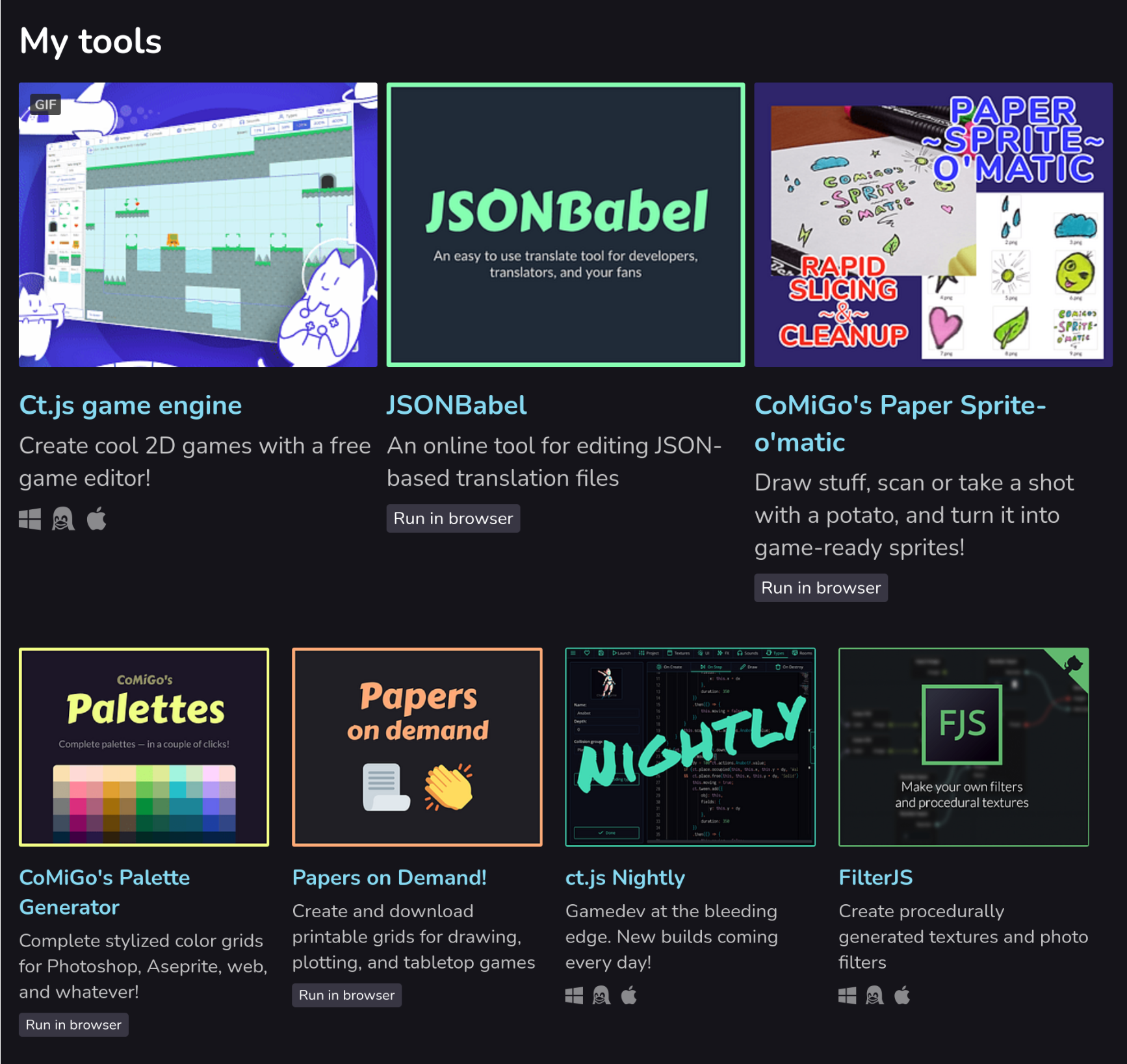
Alternative layout: 3+4 grid
Note: This tutorial requires CSS editing in your account. If you don’t have it yet, you can ask support so that they enable CSS editing for you. Also, make sure that you’ve completed the first tutorial that shows you how to set up the creator page with collections.
To make my page prettier and less huge, I’ve decided to modify my initial style set to make the first row display three projects, and the others — four.

The effect applies to each category. Here is how you can do the same.
The guide
- Open your creator’s page and click the 🖌 Edit theme button.
- Under the list of your categories/collections, set Collections > Layout to List.
- Remove the old CSS block called Collections from the first tutorial, if you have one.
- Put the following CSS code:
/****************************************************************\
| Collections in four columns, but the first one has three items |
`****************************************************************/

/* Remove from this... */
.game_grid_widget.game_list {
  font-size: 0.9em;
}
/* ...to this to make the text larger*/

.user_page .purchased_games .carousel_wrapper, .user_page .collection_row .carousel_wrapper {
  overflow: visible;
}
.game_grid_widget.game_list {
  white-space: initial;
  display: block;
}
.user_page .purchased_games .carousel_wrapper .game_list, .user_page .collection_row .carousel_wrapper .game_list {
  margin-right: -10px;
}
.game_grid_widget.game_list .game_cell {
  width: 220px;
  display: inline-block;
  vertical-align: top;
}
.game_grid_widget.game_list .game_cell .game_thumb {
  width: 220px;
  height: 175px;
}

@media (min-width: 1100px) {
  .game_grid_widget.game_list .game_cell:nth-child(1), .game_grid_widget.game_list .game_cell:nth-child(2), .game_grid_widget.game_list .game_cell:nth-child(3) {
    width: 315px;
    margin: 0 8px 2.5rem 0;
    font-size: 1.25em;
  }
  .game_grid_widget.game_list .game_cell:nth-child(1) .game_thumb, .game_grid_widget.game_list .game_cell:nth-child(2) .game_thumb, .game_grid_widget.game_list .game_cell:nth-child(3) .game_thumb {
    width: 315px;
    height: 250px;
  }
}
/*********************************\
| Collections in four columns end |
`*********************************/
Note that you have a block of five lines of code to make the text inside the grid larger.
Press the Save button. And you’re done!
Ordering your projects
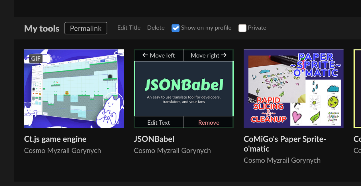
Go to My Library page and hover over projects in your collections. On top of each, two buttons for reordering will appear:

Changes are saved automatically.
Get Better creator pages at itch.io
Better creator pages at itch.io
Create categories, sidebars, "latest" sections for your profile page!
| Status | Released |
| Category | Book |
| Author | Cosmo Myzrail Gorynych |
| Tags | guide, itchio |
More posts
- Alternative layout: lists of projectsApr 20, 2021
- Quick tip: reordering projects in your collectionApr 20, 2021
- Showing a list of recent projects on your creator pageAug 13, 2020
- Creating categories in itch.io creator pagesAug 13, 2020

Comments
Log in with itch.io to leave a comment.
I’ve updated the CSS code due to recent itch.io changes!
I love it! It’s so clean and professional and perfect!